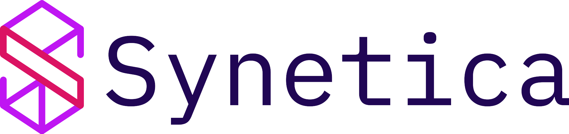
~/syn/logo
Logo anatomy
The Synetica logo has two main elements: the logogram (the geometric S-shaped mark) and the logotype (the "Synetica" wordmark).
Rationale
The Synetica logo expresses the brand's focus: help brands develop and grow through thoughtful use of AI and technology. The mark reads as something built — blueprints, growth, and raw potential — and resolves as an S for Synetica, so form and function stay in one place.
As a product-launch partner, we plan smart, build lean, test early, and scale what works. The logo's structure reflects that: clear rules, but room to move as the product does.
Logo versions in this repo
Use SVG for editable layouts and sharp web rendering. Use PNG for documents, slides, and tools that do not handle SVG well.


Available files: synetica-lightBG.svg, synetica-lightBG.png, synetica-darkBG.svg, and synetica-darkBG.png. Grayscale, monochrome, and icon-only exports are not checked into this app yet.
Clear space and proportions
Clear space
Synetica uses a unit S from the logogram height. Keep a minimum of 2S clear of text, art, and UI on every side. That space keeps the mark legible and consistent across screens and print.
Reference measurements
- Horizontal: 22S × 9S (5S for logotype)
- Stacked: 18S × 22S (10S logogram, 14S total with type)
- Clear space: 2S (horizontal) / 3S (stacked) on all sides
Minimum size
Horizontal
60 px (digital) · 100 mm (print)
Stacked
60 px (digital) · 70 mm (print)
Icon only
10 px (digital) · 50 mm (print)
Recommendation
The mark scales, but it still has a floor. Using it under the minimum hurts legibility and brand consistency. When in doubt, size up.
What not to do
Not allowed
Do not stretch, recolor, decorate, or swap type. No busy backgrounds, patterns, or off-angle placement. The logo is not a sticker pack — treat it as a system, not a suggestion.
Don't
No distortion or skew
Don't
No non-brand colors
Don't
No extra effects on the type
Don't
No low-contrast or busy backdrops
Don't
No off-guidelines color
Don't
No pattern fills
Don't
No type substitution
Don't
No odd rotation or wrong orientation
~/syn/colors
Brand colors
Midnight Purple leads. Synetica Purple adds motion. Striking Pink marks proof and conversion. Icy Gray supports dark surfaces and light sections without becoming the whole brand.
Midnight Purple
Primary text, dark sections, strategic surfaces
RGB: 32, 6, 84
HEX: #200654
Synetica Purple
Highlights, active states, key lines
RGB: 191, 22, 242
HEX: #BF16F2
Striking Pink
High-emphasis CTA and proof moments
RGB: 219, 19, 99
HEX: #DB1363
Icy Gray
Soft section backgrounds and dark-theme text support
RGB: 226, 233, 255
HEX: #E2E9FF
Midnight Sky
Hero base, dark CTA sections, layered depth
Start: #3C0862
End: #170241
Color composition
How to use it
Start from Midnight Purple (#200654). Add Synetica Purple (#BF16F2) for active energy. Use Striking Pink (#DB1363) sparingly for conversion and proof. Keep Icy Gray (#E2E9FF) as a support layer, not the dominant page mood.
On dark or midnight-gradient backgrounds, keep contrast high. Use one glow or accent layer at a time so the system feels controlled.
~/syn/typography
Primary: IBM Plex Mono
Aa
IBM Plex Mono
IBM Plex Mono is the visible signature. Use it for hero headlines, labels, specs, buttons, and section logic. It gives Synetica the engineered, decision-ready voice that the current website already has.
Body text with mono
- Use 150% line height or more
- Keep paragraphs short
- Use it for marketing pages and system surfaces
Secondary: Tasa Orbiter
Tasa Orbiter
The secondary face for long UI copy, documents, and proposals. Use it when mono becomes too dense for extended reading.
Use Tasa for supporting content and long reads. Use mono for structure, navigation, hero copy, and sign-off moments.
Legal: Source Serif 4
Source Serif 4 is for legal PDFs and formal print, not for marketing UI. Headings and body in the same family, consistent sizing, no mixing with Tasa or Plex for a casual look.
- Only for legal and compliance materials
- Not for this portal, social, or product chrome
~/syn/usage
Current-site rules
Use these rules when designing new Synetica pages, decks, documents, and internal tools. The goal is consistency without making everything flat.
| Area | Rule |
|---|---|
| Hero sections | Use dark gradient, grid layer, one glow, one glass or process panel, and a direct CTA. |
| Service pages | Use stronger visual energy: layered panels, terminal/spec previews, accent badges, and proof points. |
| Content pages | Use calmer white and Icy Gray surfaces, proof cards, and clear typographic hierarchy. |
| CTAs | Use Synetica Purple on dark surfaces, Midnight Purple on light surfaces, and Pink only for high-stakes conversion. |
| Cards | Use sharp corners, clear borders, and subtle lift. Avoid soft SaaS rounded-card clutter. |
| Copy | Lead with the problem, show the system, close with the next step. Use numbers and evidence. |
Need something else?
For one-off use cases, co-branding, or new formats, start from the current website direction and document the exception before shipping.
~/syn/current-system
The current website is the reference.
Keep the technical purple, layered depth, sharp layout, proof-led cards, and direct mono voice. Synetica should feel like a product strategy workspace, not a generic SaaS template.
Strategic panel
Validate before you build
Use dark, layered panels for product logic, process previews, and architecture snapshots.
Proof card
80% proceed to Build
Use white surfaces with one strong border or accent edge for numbers, evidence, and decision points.
Method card
Blueprint → Build → GTM → Grow
Keep it structured, scannable, and direct. It should feel like a working document.
Base
Midnight gradient creates the strategic, technical foundation.
Structure
Grid, borders, specs, and sharp panels make the layout feel built.
Energy
Synetica Purple glow and Striking Pink proof points add momentum.
Action
High-contrast CTAs close the loop without softening the page.